
Navigating the rise of technology in construction
In this article we’ll dive into the booming world of smart construction technology, exploring the innovations driving the change and what the future looks like for the industry.
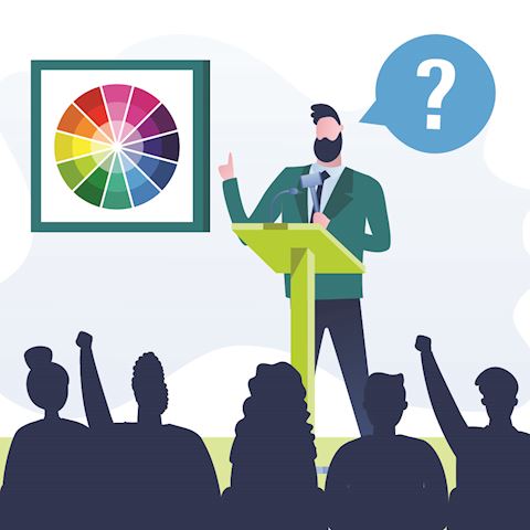
French artist Paul Gauguin once said “Colour! What a deep and mysterious language.” Colour is registered by the brain before images or typography, so a brand’s use of colour can elicit an emotional response (good or bad) which has an impact on brand recognition and perception.
Colours speak to people subliminally, in ways that are often hard to realise or articulate. Yet, understanding colour psychology can make a crucial difference when communicating your brand, enabling you to emphasise your values and purpose through the power of colour.
Using basic colour psychology in your marketing communications can have a broad positive impact in influencing the desired response in your target audience.
Here we present a whistle-stop tour of what the most used colours mean – as you go through the list, think about how the colour makes you feel and what you associate with each one.
Blue is a popular colour choice for industries such as finance and software.
Positive: Like a still lake, or a clear blue sky it possesses the power to arouse a sense of calm, which can lead to feelings of trust and safety. Brands using blue project confidence and strength.
Negative: One negative of blue could be the natural sense of coldness that blue can imply for some, which may lead to feelings of disconnect and detachment or distance, if used in the wrong way.
Red is a colour that is associated with power and excitement, hence a popular choice for entertainment and sports brands.
Positive: Red is often seen as a colour that represents passion, energy and excitement. If used well, it can make an instant impact and appeal to a spirited and lively audience.
Negative: If red is overused or has a deeper tone, it can sometimes be received as aggressive and violent.
Black is a popular colour for technology brands as well as luxury goods.
Positive: The boldness black offers can convey a sense of power and strength, as well as timeless elegance. Black can be combined easily with most other colours to deliver authority and respectability.
Negative: In certain connotations, black can also give a notion of emptiness, blindness and death.
Throughout history white has been used to represent purity, innocence and cleanliness.
Positive: These attributes can lead to a feeling of trust, clarity and honesty.
Negatively: White can be seen as stark and if used in excess with cool colours it can feel cold and isolating.
Green is commonly used for brands associated nature and creativity.
Positive: Green can represent growth and ambition. The connection to nature means that green naturally evokes a sense of calmness and peace and is considered a restful colour. Darker shades of green can also be used to represent prestige and wealth.
Negative: The downfall of green’s serenity can mean it sometimes does not make the same impact of other, bolder colours. The emotional response to green can also connotate feelings of envy or greed.
Yellow is often used for food and children’s brands.
Positive: The brightness of yellow makes it naturally warm and cheerful that stands out ahead of most other colours. It has the power of optimism and the ability to draw people in. Some may also feel that yellow represents youth, affordability and playfulness.
Negative: With certain uses, yellow can be seen to represent value/cheap/affordable - or occasionally is associated with illness, caution, cowardice, betrayal and anxiety.
Brands that are affordable, risk-taking, and joyful will gravitate towards the use of orange as it’s the perfect blend of optimistic yellow and bold red. We see the use of orange in explorer and adventurer-type brands.
Positive: Orange is an optimistic, fun and adventurous colour. Interestingly, orange can represent affordability without compromising quality. The brighter the orange, the more vibrant and sociable the associations are with the colour.
Negative: As always, a colour used incorrectly can convey a very different message and particularly with orange it could give feelings of being overbearing or superficial.
Purple is often used for brands who are considered leaders in their industry.
Positive: Purple’s association with sophistication and royalty stems from its historic difficulty to produce the colour. A person in the middle-ages with a purple robe would have been considered rich or noble – and that reputation has lasted for centuries. This elusiveness has led to purple being considered a nostalgic and mysterious colour.
Negative: For the same reasons, purple can also be seen as conveying arrogance or aloofness.
Different types of media appeals to various audiences and, although your business probably has well developed brand guidelines, we’d advise that there is importance in taking the time to consider which of the colours within your brand’s palette are best used in each activity.
So, let’s imagine you’re about to launch a new product or service campaign, so you’re aiming to inspire some excitement, and your brand guidelines state that your primary colours are green, blue and red. Here, more use of your brand’s red could help you to achieve the emotional response to your campaign that you desire, as opposed to using blue.
With the same brand guidelines, your business might want to start sending regular newsletters to its entire database. For this, the blue may play more of a pivotal role within the newsletter design – giving a sense of trust, calmness and security.
Choosing the correct colour for the occasion is important and we would encourage you to look at your integrated communications and use colour to help influence the message you’re trying to convey wherever possible.
It’s vitally important that your brand colours are prominent across all touchpoints and collateral, to provide a joined-up experience and familiarity. As we have discovered, colour has implications on brand associations and thus has a bearing on how your brand is perceived.
Now that you are armed with a basic level of knowledge about colour psychology, you may start to think about how your brand colours are utilised more closely, to portray your message in its best light, or rather, colour.
If you’re looking for help with your communications creative and strategy, contact Rachel Arquati for more information on how Clear B2B can help your business.
In this article we’ll dive into the booming world of smart construction technology, exploring the innovations driving the change and what the future looks like for the industry.

Learn how to use presentation opportunities as an effective lead-generation tool in your trade show activity.

Great marketing success comes from keeping your communications focused, engaging and simple to ‘get’ - but that isn’t always so simple to achieve.

With multiple types of technologies being considered, we bring you a snapshot of alternative fuels and review the most prominent pros and cons for each one.
